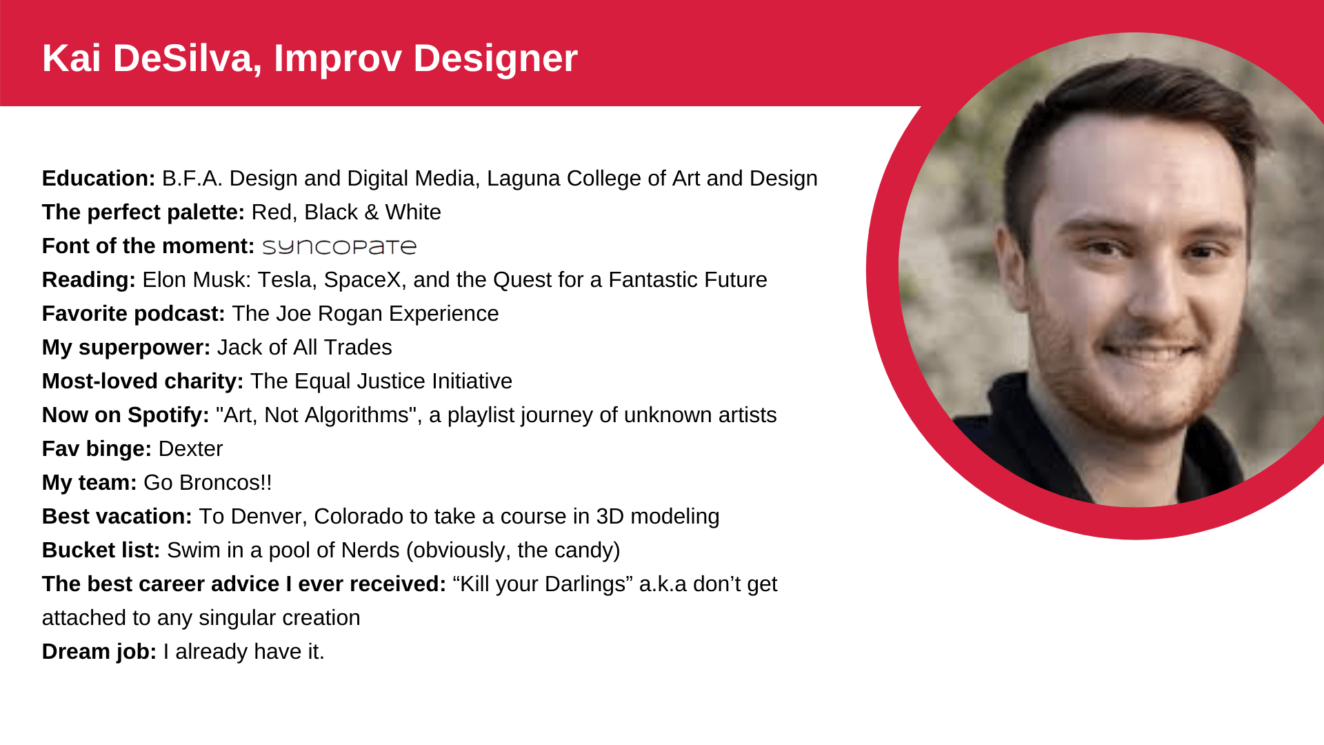

Rarely is anyone's career strategy to blend in more than they stand out. Think about it. Growing up, we are told to shine bright and exceed expectations at work. However, when it comes to the art and practice of visual design, often the last thing you want to do is to stand out — in the wrong way, that is. Therein lies the artistry and intuitive media sensibilities of Improv's in-house Designer, Kai deSilva.
Improv's brand visionary and animation pro, Kai joined the team two years ago and has since ignited an approach to branding that has continued to fuel its visual trajectory.

A disclaimer: In general, at Improv, we try to avoid touting the talents of our team members and high-fiving ourselves. Our team is strategically curated (think Avengers or Starfleet). Each person is critical to the success of Improv. Our in-house Designer, Kai deSilva, is one of those people.
When Kai joined Improv in 2018, the design charge was simple. Create a brand that's engaging, trustworthy, and headed full-throttle toward the future of SaaS.
He started with upgrading Improv's 12-year-old logo, then moved on to work with the Marketing team to rebuild and rebrand the company's website and marketing collateral.
"Each gear tooth in our logo represents a core company value, so we kept that existing symbolism, but the rest of the branding wasn't quite right," says Kai. "I knew that our brand's gradual development would ultimately be the most creative and advantageous way to grow organic credibility."
While still in his Junior year of College at Laguna College of Art and Design, Kai began working on an overall brand scheme that embodied Improv's distinct culture and expressed the intersection of technology and human relationship.
He found inspiration from some of his favorite large tech firms. In studying the design philosophies of companies such as Google, Slack, Stripe, and Microsoft, Kai created a fluent design system that expressed Improv's expertise and innovative spirit.

Less = More
Improv's new website design echoes its methodology: the best solutions are never the most complicated.
"The website redesign philosophy was to keep everything clean," Kai explains, "When it comes to user experience, less is more. Clean and straightforward web content is the secret to engaged readership."
Creating vibrant, custom 3D graphics that worked in tandem with revamped, brand-centric copy, expressed the company's core attributes that have existed all along.
"My goal was that we look as good on the outside as we operated on the inside," says Kai. "Our people and our culture drove design from day one."
The Art of Blending In
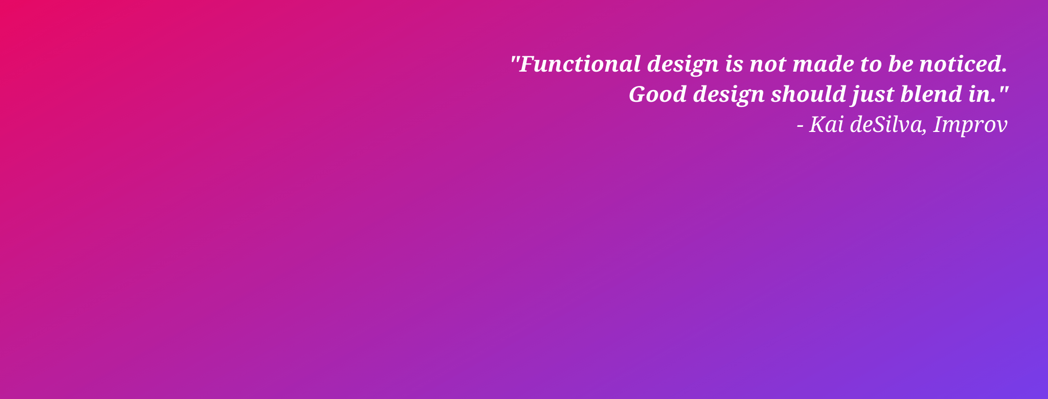
Kai accomplished Improv's rebrand following one simple guiding light: blend in. He believes, "users shouldn't notice good design; it should just blend in."
Kai explains the juxtaposition this way.
"A lot of times, companies leap into a branding initiative to break through the mold and create the biggest splash possible," says Kai. "The problem with that approach is that if you recall company graphics you've seen in the past, it's hard to remember the good ones. But the bad ones? They almost always stand out."
Kai’s "blend in" theory springs from consumers having marketing images and messages thrown at them from every angle 24/7.
"Blending in is what makes your big visual splash more of a swan dive and less of a belly flop. But, this is much hard than it looks. Streamlined simplicity is one of the most challenging forms of art."
According to Jenna DeVries, Director of Business Development, another component of Improv's branding evolution is the company's commitment to having a dedicated, full-time Designer on staff.
"Making Design and Content a priority has allowed Improv to establish a fluid, clear brand story that strategically positions us in the consulting arena," says Jenna. "Design has become an integral part of our Marketing and Sales process - I believe that has contributed to our ability to thrive — even during a pandemic. We are dedicated to creating a culture and brand that people WANT to be a part of."
Creativity + Logic
From motion imaging and 3D animation to coding and web development, Kai's talents fuse creativity and logic, a good combination to have in the SaaS space.
"SaaS marketing is challenging because there is nothing physical about the product," says Kai. "You design based purely on the emotion evoked either when using the software, whether it's frustration, optimism, or relief, you name it."
This theory comes to light in the new branding of Ultimate Kronos Group (UKG) (we've all seen it by this point, right?). Their new logo evokes positive emotion by tying their people-first tagline into the design with a smiling umlaut above the 'U.'
Kai notes, "The rebrand makes UKG feel approachable and trustworthy, just like how we try to design for Improv."

Design + Coding
Being a graphic designer in a world of programming could be intimidating to some. Employing creativity in software coding isn't a natural pairing. But actually, says Kai, the two disciplines are a match made in tech heaven.
"Software and graphic design have an abundant amount of adjacencies, as displayed in programs such as Workforce Dimensions," says Kai. "Our shared goal is to enhance functionality, whether it's through a webpage design or a hardcoded interface.
"As designers and coders, we are taught not to get attached to specific trends, innovations, media, or software. We're adaptable and taught to move with the times. Resisting change doesn't work."
Wherever you go, poor design seems to follow, whether it's pushing a door marked "pull" or aimlessly trying to customize a new app. But the good design? It's clean, it's clear, and it works. And, like a Kronos implementation, it's that beautiful simplicity that keeps the Improv team invested in everything we do.
Now You Know Our Secret.
Want to know more? Our consulting team will help you find creative Kronos solutions be it optimization, an implementation, or an upgrade. To learn more about how the Improv team approaches each project, grab this download.


.png)
.png)
.png)
Comments